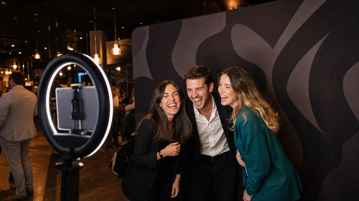
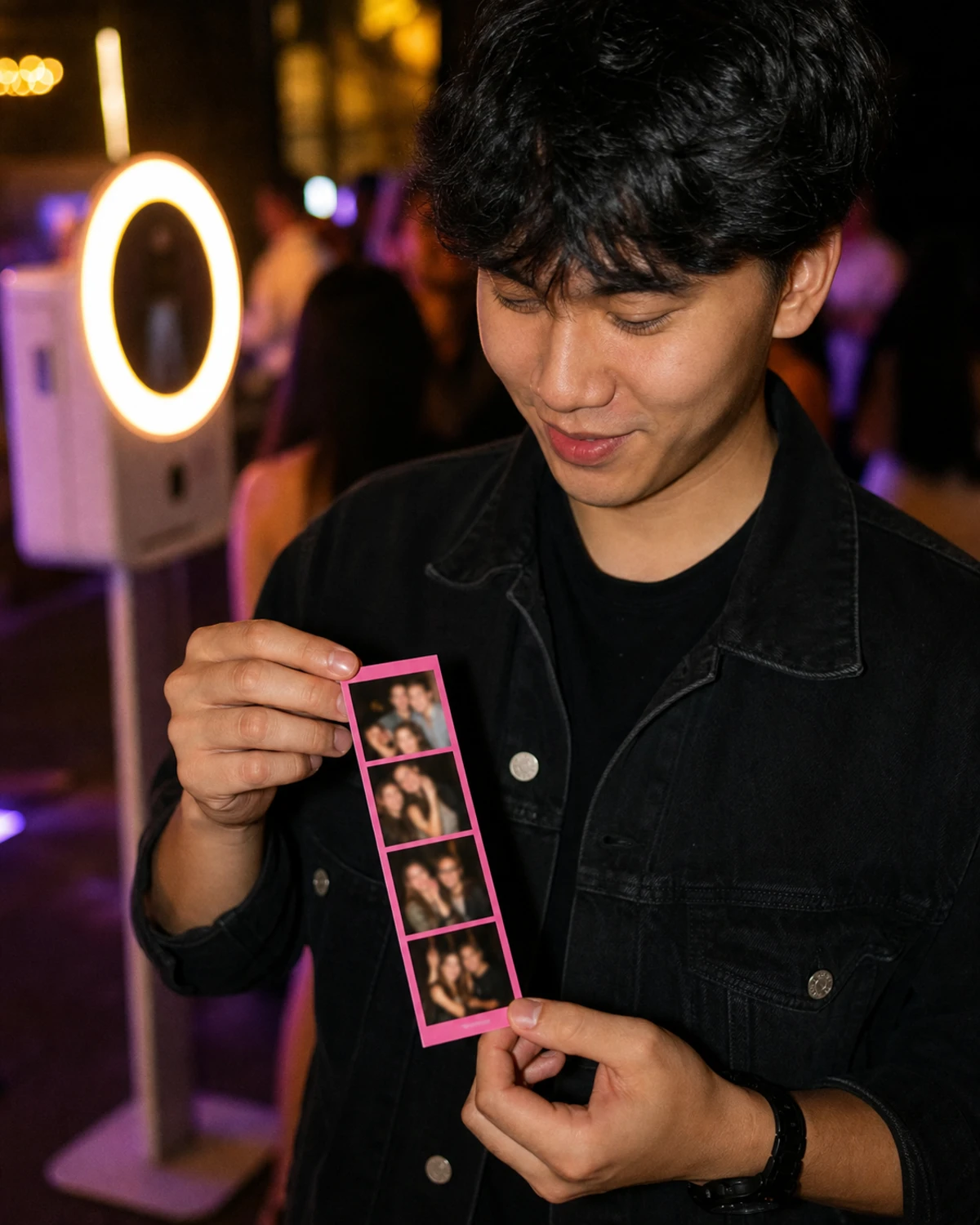
At a product launch, a guest steps into the booth, poses, watches the screen count down, and walks away with two things: a printed strip tucked into a pocket and a digital copy already texted to a friend. Both photos carry a thin band of brand graphics around the edge, a logo in one corner, a campaign hashtag along the bottom, the event’s colors framing the shot.
That band is a custom branded photo overlay: a transparent graphic layered on top of every photo, GIF, and video a booth captures, carrying a brand’s logo, colors, and campaign details. It is easy to treat it as a production detail, something a designer handles the week before the event. That is a mistake. The overlay rides on every print a guest pockets and every photo a guest posts, which makes it the most-distributed asset the whole activation produces. A backdrop is seen by the people in the room. The overlay leaves the room.
So its dimensions and design are not housekeeping. They raise or lower how often a branded photo gets shared. What follows covers both halves most pages keep separate: the specs (sizing, file format, resolution) and the design rules that decide whether a guest posts the photo or buries it, plus a checklist to run before the event.
What a Branded Photo Overlay Actually Is (and What It Isn’t)
A marketer sends the booth vendor a logo file, the same PNG that sits in the website header, and expects branded photos in return. At the event, every photo comes back with the logo planted dead center, sitting on top of guests’ faces. The booth did exactly what it was told. The file was wrong for the job.
This is the most common and most documented overlay
This is the most common and most documented overlay mistake, and it comes from conflating four separate things.
An overlay is a finished, full-layout transparent graphic placed on top of the captured photo. Think of it as a pre-positioned sticker the size of the whole frame, with a clear window cut out where the photo shows through. The design is built around that empty window.
A logo is a single brand mark. Most booth apps give a logo its own dedicated space beside or below the photo frame, not on top of the image. Drop a bare logo into the overlay slot and the software has nowhere to place it but the middle, directly over the shot.
A template or layout is the underlying grid: a single photo, a 1x2, a 1x3 strip, a square, a 2x2 collage. It sets the size and shape, and the overlay is built to fit it.
A backdrop is the physical printed wall behind the guest, a separate asset photographed into the shot rather than layered onto it.
The fix for the logo-in-the-middle problem is conceptual, not technical. The overlay is the entire framed composition, designed around an empty photo window. It is not a logo that the software positions on the operator’s behalf. Booth apps also differ in how they label this: some keep a discrete “overlay” setting, while newer layout designers add the graphic as a layer inside a visual editor. The label changes; the principles (transparency, exact sizing, edge-focused composition) do not.
Why the Overlay Is the Highest-Leverage Brand Asset
Picture two identical activations on the same day: same booth, same foot traffic, same four-hour window. One runs a clean overlay, a thin border and a small corner logo with the photo filling the frame. The other runs a heavy one: a fat branded band top and bottom, a large logo, a tagline, a sponsor lockup. The second looks like it is branding harder. It is doing the opposite.

Here is the mechanism
Here is the mechanism. Every guest who uses the booth leaves with a photo carrying the overlay, and every photo a guest posts carries the overlay into a feed. A backdrop or a booth wrap is seen only by people physically in the room; the overlay goes wherever the photo goes. That makes the share rate, the proportion of guests who actually post their photo, a direct input to the activation’s reach. A cluttered, logo-heavy overlay does not lift branding, it lowers the share rate, because people share photos that flatter them, not photos that look like ads. The moment an overlay reads as an advertisement, the instinct to post it drops.
That share rate has become a number worth defending. EventTrack’s 2026 industry survey found that PR and media coverage is now the single most-measured objective for consumer event marketers, ahead of brand awareness for the first time. A photo activation earns that coverage in social feeds, and the overlay is the brand’s only presence there once a guest posts. Push the share rate down and the activation underdelivers on the exact metric its sponsor watches first.
The cost of that is measurable
The cost of that is measurable. Take a four-hour activation that runs about 200 photo sessions. Each shared photo reaches a modest audience. Figure 200 accounts per post, a deliberately conservative number, since Instagram organic reach is low and still declining (Socialinsider’s 2025 data puts the average near 3.5% of a follower count). Reach converts to earned media value with a formula standard across PR analytics: EMV = (impressions ÷ 1,000) × CPM (Meltwater, 2026).
The scenario uses a conservative $10 CPM. Run the clean overlay and assume 65% of guests post their photo: 200 × 0.65 × 200 works out to 26,000 impressions, roughly $260 in earned media. Run the heavy overlay and assume the share rate falls to 35%: 200 × 0.35 × 200 is 14,000 impressions, roughly $140. Same booth, same budget, same guests. Overlay design alone moved about $120 of earned media in a single four-hour event, and the gap widens with every extra hour and every busier room.
The exact share rate is the soft number in that scenario. Industry research is dated: EventTrack’s 2016 study found that 98% of consumers create digital or social content at branded events and effectively all of it gets shared, but that figure is a decade old and was co-produced by an experiential agency. The precise percentages are not the point. The structure is. Of every term in that equation, overlay design is the one a marketer fully controls before the doors open.
Overlay Sizing: Dimensions, Layout, and Orientation
An operator designs a sharp overlay in the afternoon, uploads it an hour before the event, and the booth stretches it across the layout: the logo now wide and soft, the border thicker on two sides than the other two. Overlays do not scale gracefully to fit. A file built at the wrong dimensions is not resized politely, it is distorted to force a match.
Overlay dimensions are derived, not chosen
Overlay dimensions are derived, not chosen. Four decisions come first, and the correct size follows from them:
- Layout type. A single photo, a 1x2, a 1x3 strip, a square, a 2x2 collage. Each has its own proportions.
- Camera orientation. Portrait or landscape. A landscape overlay matches a landscape layout and a portrait overlay matches a portrait layout. They are not interchangeable.
- Crop and margins. A square crop, a circle crop, or no crop, plus how thick the border sits.
- Whether a separate logo block is also enabled, which changes how much space the overlay itself has to fill.
Change any one of the four and the correct pixel size changes with it. A few portable reference points:
| Output | Standard pixel size | Notes |
|---|---|---|
| 2x6 photo strip (print) | 600 × 1,800 | 2 in × 6 in at 300 PPI |
| 4x6 card, portrait (print) | 1,200 × 1,800 | 4 in × 6 in at 300 PPI |
| 4x6 card, landscape (print) | 1,800 × 1,200 | landscape orientation |
| Square digital file | 1,080 × 1,080 | 1:1, fits the social feed |
| Vertical digital file | 1,080 × 1,350 | 4:5, fits the social feed |
These are starting points, not a substitute for the real number. Booth software displays the exact final pixel dimensions for the chosen layout in its design panel, and that figure adjusts as the layout, crop, orientation, and logo settings change. The reliable workflow is to lock the four decisions, read the dimensions the software reports, and build the file to match exactly. Anything destined for print should be built at 300 PPI, the resolution LA Photo Party’s specs and standard commercial printing both call for, so the takeaway stays sharp in a guest’s hand.
File Format, Transparency, and Resolution
A guest steps up, the booth counts down, and the printed photo comes out as a solid white rectangle with a logo on it. No guest, no shot. The overlay was saved as a JPEG.
JPEG has no alpha channel, the layer that tells software which pixels are see-through. Saved as a JPEG, every transparent region of an overlay turns solid white, including the window where the guest’s photo is supposed to appear. The format is not a preference. A branded photo overlay is a transparent PNG, always. Eyelykit’s design guide calls understanding transparency “the single most important technical hurdle for new creators,” and the failure mode is identical on every platform.
The transparency check is quick
The transparency check is quick. In the design editor, the photo area and any unused space should show the gray-and-white checkerboard pattern that signals see-through pixels. If those areas read as white, the file is wrong. Most of the overlay should be transparent. Only the borders, text, and graphics are opaque.
Resolution follows the output
Resolution follows the output. Print at 300 PPI so the strip looks crisp up close. Digital-only and virtual booths often cap file size, so the digital version should stay lean rather than maxed out. One more detail that costs nothing to get right: build the artwork in the brand’s exact hex values, not eyeballed approximations, so the overlay matches every other branded surface at the event.
Design Rules That Make the Photo the Hero
A client reviews the overlay proof and asks for the logo to be bigger. It is a reasonable instinct, the brand is paying for the booth and a bigger logo feels like more value. It is also the request that quietly costs the activation reach.
The governing principle settles most arguments: the guest’s photo is the hero, the overlay is the frame. Every rule follows from it.
- Build around an empty center. Keep graphics at the edges and corners and leave the photo window clear. Anything placed in the middle lands on a face.
- Do not box the photo in. A heavy border weighted on all four sides makes the shot look trapped. Letting one or two edges breathe keeps the photo looking like a photo, not a placard.
- Respect safe zones and bleed. Keep logos and text inside a margin of roughly a quarter-inch from the trimmed edge, the convention Eyelykit’s guide and standard print practice both use, so the cutter never slices off something that matters. Account for where heads usually sit in each layout so the overlay never crosses a face.
- Keep the logo small and corner-set. A small mark in the same position on every photo builds recognition through repetition. Brand managers in Marq’s survey of 400-plus organizations estimated that consistent brand presentation could lift growth by 10 to 20%, a self-reported figure rather than a measured outcome, but the mechanism it points to (recognition compounds when the mark is consistent) is the relevant part. A large logo does not brand harder; it makes the photo less postable.
- Choose contrast and legible type. A hashtag set in a thin decorative font over a busy photo is unreadable at a glance. High-contrast color and a clean typeface survive the half-second a guest spends looking.
- Edit down. Overcrowding is a named, recurring failure in booth design guidance; Mel Booth Magic’s guide lists it among the most common template mistakes. Fewer elements, placed well, beat a full frame every time.
Print vs. Digital: Why One Overlay Often Isn’t Enough
One booth session usually produces two different things. The booth prints a strip or a card the guest carries out, and it sends a digital copy to the guest’s phone by text, email, or a QR-code link. Operators who build a single overlay for both outputs tend to learn the hard way that these are not the same job.
The print is the physical takeaway
The print is the physical takeaway. It needs bleed, trim-safe margins, and a layout that holds up at a small physical size. The digital file is the reach engine, the version that actually travels into feeds, and it should be sized for the screen it lands on, square (1:1) or vertical (4:5), the proportions that sit naturally in a social feed. Simple Booth’s HALO, for example, added WhatsApp to its delivery options in late 2025, putting that digital copy directly into a channel a guest already uses to share.
The digital file is also the only sensible home for a campaign hashtag, a social handle, and a QR code. None of those work on paper. A QR code cannot be scanned off a printed photo at the size guests carry, and a hashtag in print produces no clickable action. They function only on a screen.
The practical takeaway: plan two overlay versions built from one brand system, not one file stretched across both outputs. And because the digital version is where shares happen, it earns the closer design attention of the two.
How to Spec, Build, and Approve an Overlay Before the Event
This is the checklist a marketer can hand a designer or vendor, and the one an operator should run before any paid event. Each step exists because skipping it produces a specific, repeatable failure.
- Lock the layout, orientation, crop, and margins first. Every dimension depends on these four decisions, so settle them before anything is designed.
- Read the exact final pixel dimensions for that locked layout from the booth software’s design panel.
- Build the file at those exact dimensions on a transparent background.
- Keep the photo window clear and place all brand elements at the edges and corners.
- Stay inside the safe margin, account for print bleed, and check where faces land so the overlay never crosses one.
- Keep the logo small and corner-set. Push back, with the share-rate reasoning, on requests to enlarge it.
- For the digital version, add the campaign hashtag, the social handle, and a QR code. Leave them off the print version.
- Export as a transparent PNG and confirm the checkerboard shows through the photo window.
- Run a real test capture and a test print, and view the digital output at phone size before sign-off.
- Get written client or stakeholder approval on the proof before event day.
The overlay is the asset approved last and studied least, and it is the only one that leaves the building on every guest. An hour spent getting the proof right returns more reach than almost anything else on the run sheet.
Sources
- Socialinsider (2025). ”[What Data Says] Social Media Reach Has a 12% YoY Decrease on Instagram.” https://www.socialinsider.io/blog/social-media-reach/
- Meltwater (2026). “Earned Media Value: A Practical Guide for PR Teams.” https://www.meltwater.com/en/blog/earned-media-value
- Event Marketing Institute / Event Marketer (2016). “EventTrack 2016: The Content Benchmarking Report.” https://www.eventmarketer.com/wp-content/uploads/2016/05/2016EventTrackExecSummary.pdf
- Event Marketer (2025). “Exclusive Research: EventTrack 2026.” https://www.eventmarketer.com/article/exclusive-research-eventtrack-2026/
- Eyelykit Studio (2026). “How to Make an Overlay.” https://www.eyelykit.com/advice-for-photo-booth-owners/how-to-make-an-overlay/
- LA Photo Party (2025). “Graphic Dimensions and Sizes.” https://support.laphotoparty.com/support/solutions/articles/5000759985-graphic-dimensions-and-sizes
- Mel Booth Magic (2025). “Photo Booth Photo Template Sizes, Layouts & Design Guide.” https://melboothmagic.com.au/photobooth-photo-template-sizes-layouts/
- Marq (2019). “The State of Brand Consistency.” https://info.marq.com/resources/report/brand-consistency